
 Live Website (Archive)
Project Overview
Technologies Used:

Figma

Webflow
Role: Product Designer & Webflow Developer
Timeline: May 2026 - August 2026
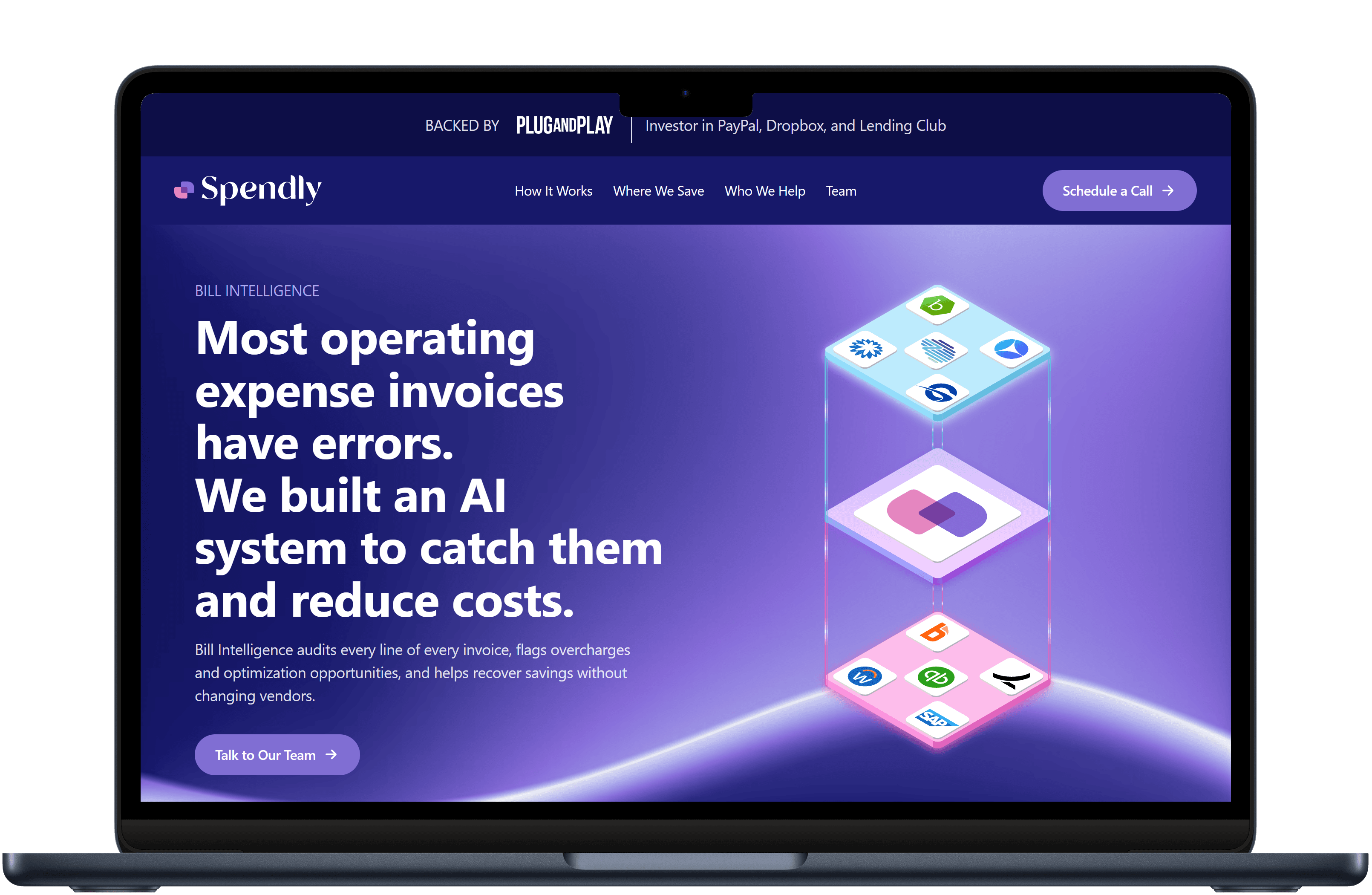
Summer website redesign of Spendly, a B2B startup targeting enterprise, investment banking & mergers and acquisitions, private equity, and partnership clients. Spendly went from a basic Webflow template with stock images to engaging UX illustrations and a more "dealmaking" layout and design that reached 300+ monthly unique visitors.
Design & Development Process
The first step in the Spendly redesign project was understanding the company's website pain points. The company claimed that the templated site felt too generic, which aligned with my initial impression given the use of stock images to seemingly compensate for the lack of strong visuals. While continually learning about Spendly throughout several meetings for syncs across this project and other ones, I conducted a competitive analysis of successful financial technology (fintech) websites to identify what exactly a Spendly website could look like, and the following sites inspired the final design:
- Stripe's use of a dedicated statistics section with a stronger sense of visuals to reinforce the value proposition, as well as a stronger use of branding colors to emphasize certain sections such as the hero section.
- BILL's Spend & Expense's interactive yet automatic high-level step demonstration of the three steps (ingest, analyze, save).
Next, I began the design process by creating a low-fidelity prototype via Figma to visualize the new layout and design of the Spendly website, with team members afterwards providing a prototype of their own via Claude Design, which provided an initial pre-approved layout and "dealmaking" text content that sparked further discussion and ideas for an on-brand high-fidelity prototype. The high-fidelity prototype went through four iterations, with the primary changes involving capturing a stronger use of branding colors with custom mesh gradients and UX illustrations to personalize and provide stronger visualizations to parse the value proposition of the product. My primary UX illustrations were the three-step illustrations showing how Spendly works, which drew on BILL’s step demonstration, and the animated isometric finance stack in the hero section. I followed the same design ethos throughout the four additional pages dedicated to specific B2B verticals: stronger emphasis on branding colors, and high-level, yet concise illustrations for the target audience.
Results & Learning
"The new website is a huge improvement over the old one. The design is much more modern and professional, and the content is much more clear and concise. The new website is also much more engaging, with the use of illustrations and animations. Overall, I am very happy with the new website and I think it will help us attract more customers." —Matthew Godley, Co-founder & CEO of Spendly (August 21st, 2026)
It was a great privilege to be the sole designer and developer of a redesign project for a startup with 300+ monthly unique visitors. Despite all the pivots that were made internally and at times feeling like no initial progress was being made, I persevered due to my professionalism and commitment to the company and the project, no matter how many initial designs or directions were scrapped in the process. On the technical side, I learned how to create more complex UX illustrations (e.g., isometric illustrations via Figma) and utilized an AI workflow that didn't replace my interdisciplinary design and development skills, but rather amplified them with subtle motion design, SEO audits, and performance fixes (particularly with SVG files that were too large due to a rasterized export from Figma) that led to a high 90s PageSpeed Insights score for the website on both desktop and mobile.